Graphic designer based in Valencia. Branding, 3D & 2D Animation,
Web design, Editorial, Digital design & Artworks.
Helsinki 40 — Editorial Design for a Slow Journalism Sports Publication
Branding. Editorial Design.
Helsinki40
2025
Helsinki 40 was born in November 2020 as a digital media outlet founded by six young journalism students, in collaboration with the University of Zaragoza, who shared a passion for sport and slow journalism. Its mission was to tell stories that went beyond scores and records, weaving politics, history and society into every piece. Over time, though, the project went quiet and its digital platform became outdated. This editorial publication marks its rebirth, bringing together the best stories the outlet published in 2021 in a high-quality printed format. It was created alongside a rebrand of the outlet’s visual identity. The name comes from the 1940 Helsinki Olympic Games, cancelled because of the Second World War, which sums up the outlet’s philosophy of bringing sport, politics and history together. As co-founder and writer of Helsinki 40, I approached this project, my Master’s thesis in Graphic Design and Communication, with a very personal connection.
A collector’s piece, not just a magazine
The publication is more than a magazine. It’s a collector’s item that makes the case for slow, in-depth journalism. Its design moves away from the conventions of traditional sports media, with an artistic, conceptual approach that invites readers to follow each story through both the text and the images.
Format: a stack of newspapers
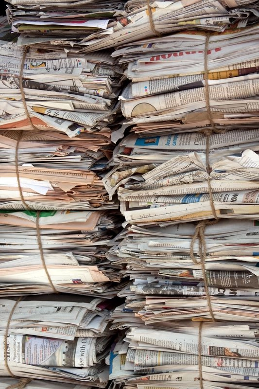
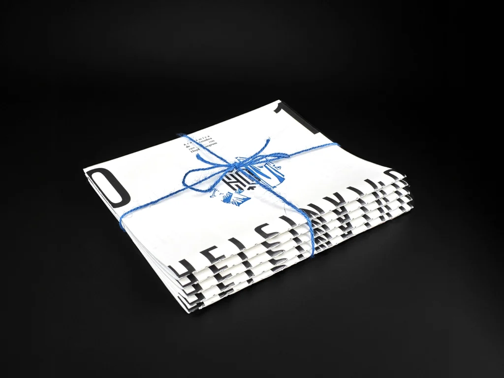
The format pays tribute to the printed newspaper, a symbol of journalism from a time before constant information overload. The publication has no spine. Its 176 pages are split into five independent folded sections, each holding two stories, so that together they look like a stack of newspapers tied up and ready for delivery. The outlet’s identity sits on the fold of each section, creating a repeating pattern when they are stacked. A folded A5 sheet works as the cover and holds the index.
Layout, typography and colour
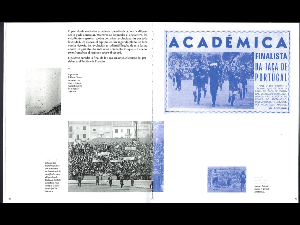
The layout draws on vintage newspapers, with grids and text blocks that make the most of the page, and on poetry books, which inspired the opening pages of each article and their slower, more reflective reading rhythm. The typefaces are Gentium Book Basic for body text and Antonio for headlines, alongside typefaces based on the original fonts used by the press to report each event. The design also features original newspaper headlines from the time.
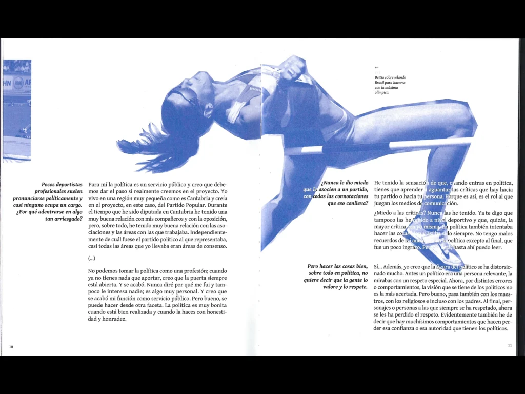
Inspired by 1960s and 70s sports newspapers, the publication is printed in two inks only: black and Pantone 7455 C. This keeps production costs down and gives the piece an instantly recognisable identity. Each future annual edition will switch to a different Pantone colour while keeping the same look.
Illustration and photomontage
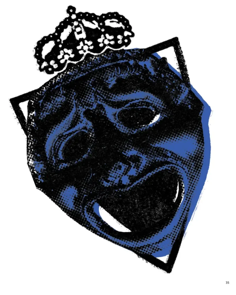
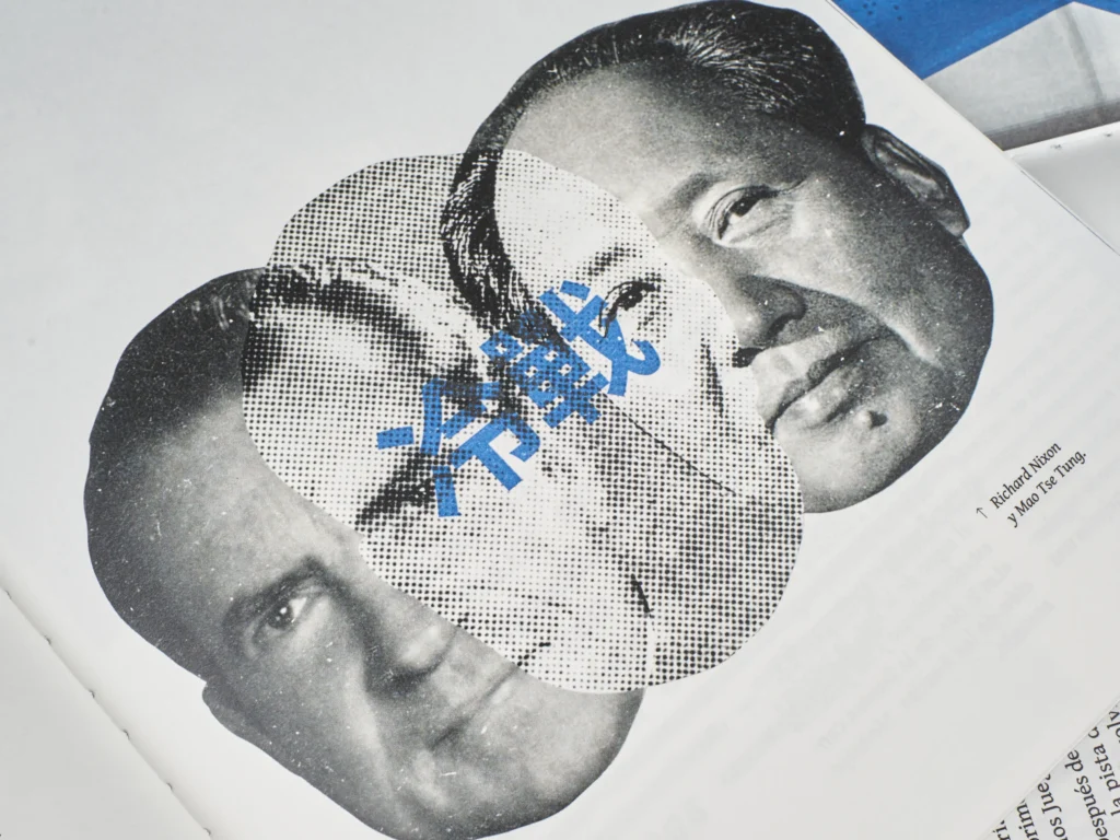
Each story comes with at least one original illustration or photomontage made specifically for the publication, many of them sketched by hand and then digitised. Grain and print-and-stamp effects tie them all together, emulating newspaper printing and paper clippings.
Contents
The publication brings together ten features, photo stories and interviews covering football, boxing, golf, table tennis, marathon running, figure skating, high jump and karate. They were selected to balance topics, sports, journalistic genres, authors and the gender of the people featured. Among them are interviews with Ruth Beitia and Babacar Seck.
Credits Editorial design, illustration and photomontage: David M Ballarín (ByDMB) Master’s thesis, Master in Graphic Design and Communication · Supervisor: Jaume Marco